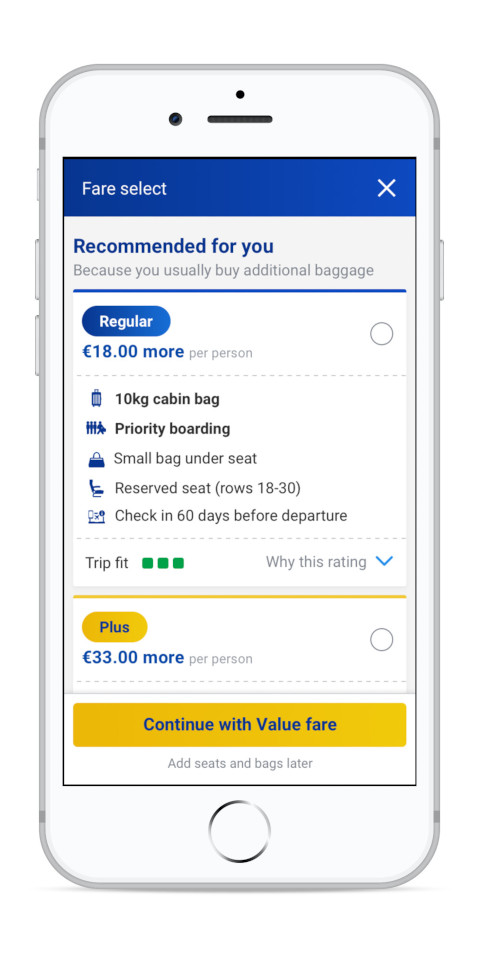
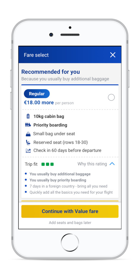
Design strategy
After the experience of COVID-19 and its impact on business operations in terms of largescale cancelations and the required customer support to resolve issues there was a growing consciousness within the business to invest in the post-booking experience and enable customer self-service. One of the biggest projects to achieve this was designing a new manage booking page.
Before starting the project, it was important to find out why Ryanair customers contact Customer Service, if they were interested in self-serving online and what’s preventing them to do so. A quantitative survey was run with 2,441 respondents on a random group of customers that have flown with Ryanair in the last month. The results were largely impacted by COVID. The main reason for contacting CS was changing booking details (along with COVID). 90% of customers contacting CS reviewed the website/app before to check if their query/issue could be self-managed, of those 81% declare that the query could not be solved on the website (due to lack of information, technical issues, individual concerns, and misleading information on the website related to changing flights and/or refunds). From the 19% who could solve it using the website 33% had additional questions and 20% needed reassurance. These results indicate a clear desire from customers to self-serve online, but that the current website does not allow them to do so successfully.
A data analysis was also conducted on tagging done by CS agents when resolving customer issues. This indicated that managing a booking represented the number 1 reason for contacts equalling 36% of all chats and calls conducted in 52 weeks (based on a pre-covid data sample). From the manage booking category 15% were relating to confirming booking details (like products/dates/status) and the rest were related to specific functionalities like change passenger type (child/teen/adult) with 8%, change flight with 6% or changing a name with 3% for example. This data indicates that users are unable to check basic booking information and complete certain functionalities which could be indicative of bad information architecture and a complex design.

Following the data indicated there were problems with the current website which is why a UX heuristics and best practices analysis was conducted to help identify these problems in order to resolve them during the redesign. The current page has a complex information architecture because there is an illogical separation of information about your trip and actions to modify this or add new products. This makes the page hard to navigate and it is not intuitive to use.
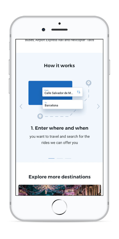
After having identified user problems with the current page and before starting the redesign process it was important to get a more in-depth understand of why users come back to an airlines website after they’ve bought their flight, what they are hoping to accomplish and what their ideal post-booking experience would look like. A brief interview with 12 customers was conducted to find this out. Most users go back to the website where they booked their flights generally to check if everything is correct with their booking (flight dates and times, seats, bags, meals) and the flights are still scheduled on time. There seems to be a sort of anxiety or a “trust issue” that’s driving these visits so there wouldn’t be any surprises during their travels. Any additional tasks they wanted to accomplish were usually related to modifying or adding products like seats or bags. Most users described an ideal experience with words like “simple”, “quick log in”, “easy to read”, “one simple page” with all relevant information and “everything laid out”. The emphasis is on not wanting to look for information or having anything too “fancy”.
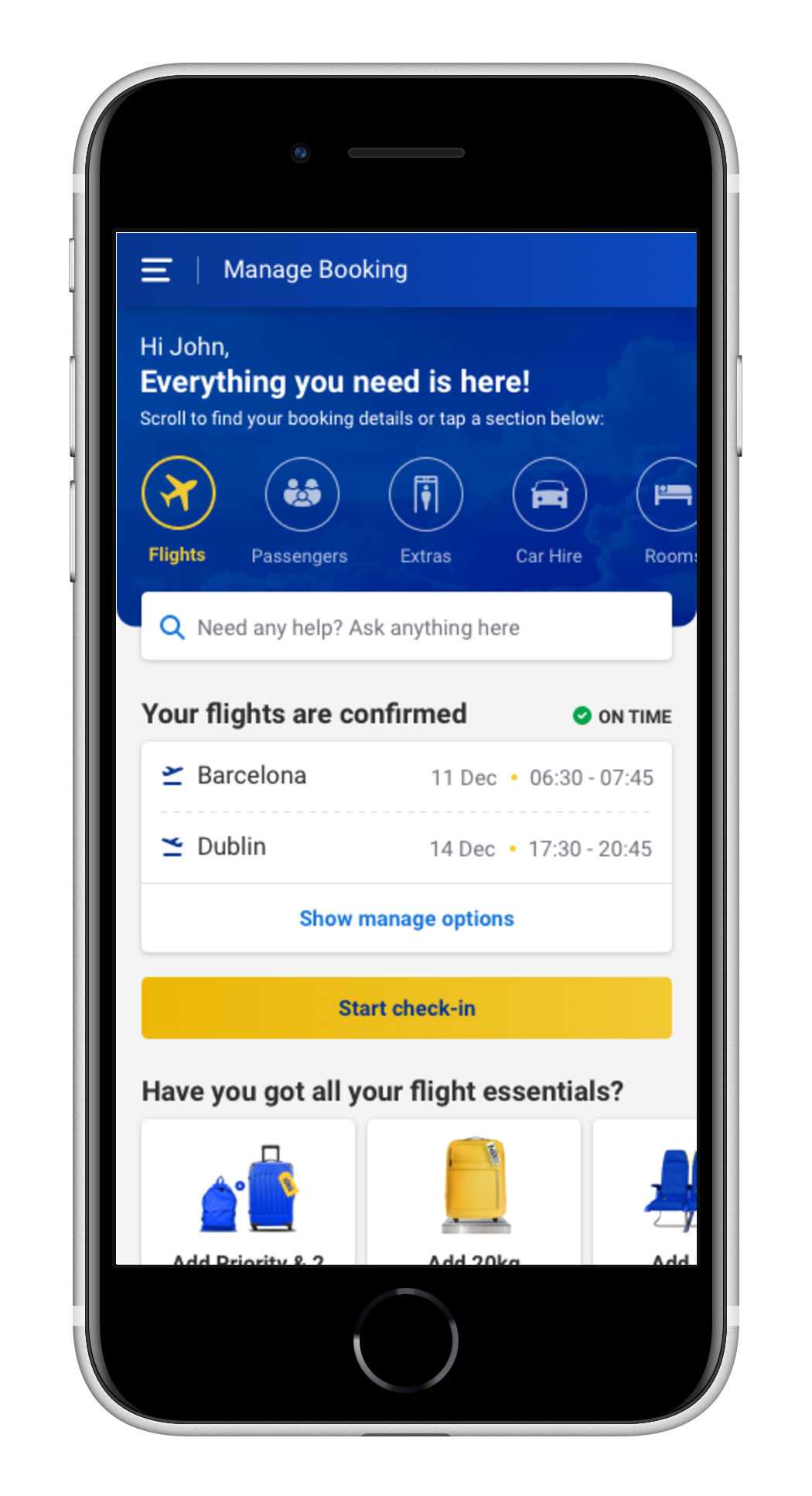
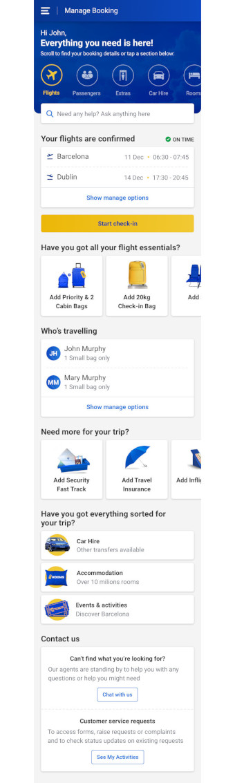
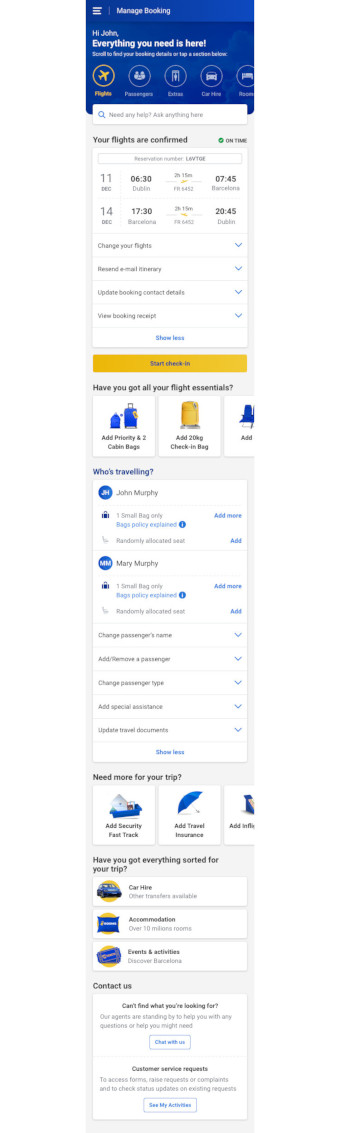
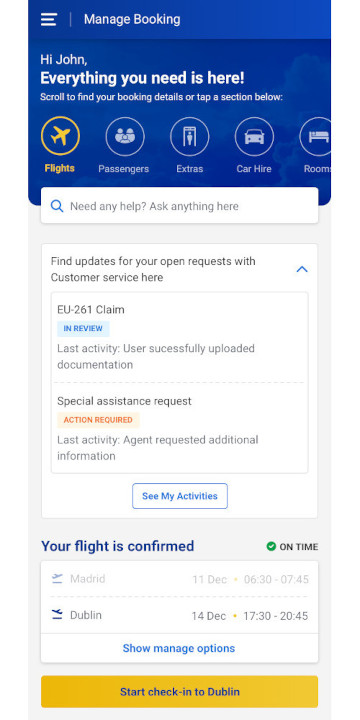
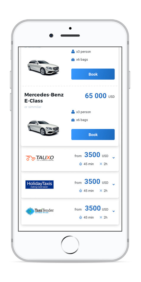
Based on the data and research the main logic behind this new redesign is to present the users with all the information about their upcoming trip in the simplest form and provide them quick and easy access to modifying and adding new things to their trip. Most of the users will benefit from this and be more secure about what they have booked for their upcoming trip.
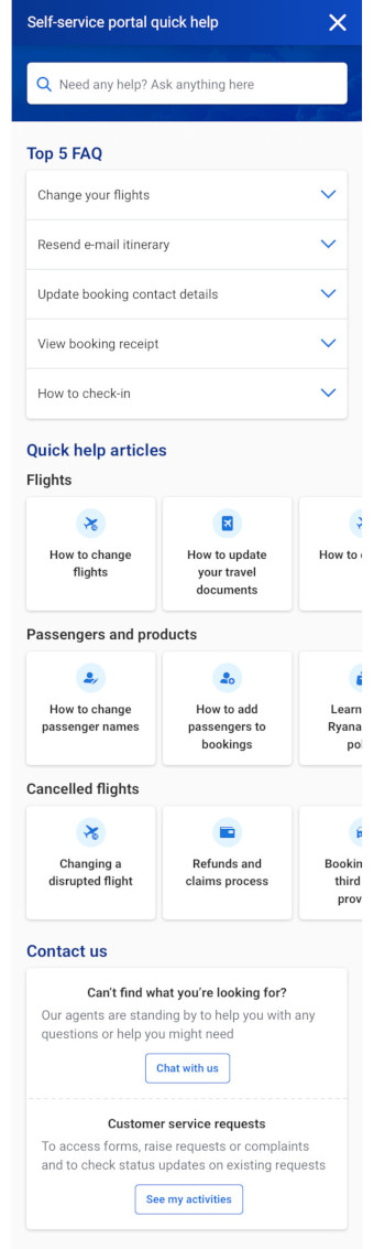
Another main objective of this project is to try and improve the experience of users that have a certain problem. Based on the survey results 90% of users try to self-serve before getting in contact with CS. Therefore, another big addition to this redesign is the inclusion of quick help articles next to relevant functionality that will provide most important information for possible problems based on issues customers most commonly get in contact with CS for. This is a great example of proactive customer support where we anticipate the problems users might have and help solve them before they escalate.
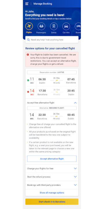
Considering flight cancelations are one of the highest contact drivers for CS and probably the most stressful situation for customers designing a clear and easy way to manage this situation was critical. The redesign in this scenario follows the main logic as well, we present clearly which flight is affected and right bellow we offer the possible solutions with quick help articles that answer questions or calm doubts users might have. This is all encouraging users to self-serve and resolve their cancelation quickly and easily. A worthy note is the inclusion of a new quick option to accept an alternative flight, these would be offered if there are available flights on the same route +/- 1 day of the original flight. This way users can solve the situation with just 1 click and enjoy their trip without any further stress.
Findings
A round of unmoderated users testing was performed on the main design and cancelled flight scenario to verify the usability of the solution.
The results were excellent, and all the testers could complete all of the tasks which were based on the identified top contact drivers to CS (e.g. check basic booking data like baggage allowance, change a flight, change name…).
One improvement that came up was making the search bar sticky when users scroll down the screen so they always have a clear call to action if they need any help as users couldn’t remember anymore where they can search on the page once they were further down.
Additionally, a moderated user testing was conducted with 6 Ryanair customers that were in contact with CS previously. They were presented with the same set of tasks to complete both on the redesign and the current website. The order in which they viewed the versions was randomized so that any bias because of this might be avoided.
Overall, the new design received very positive feedback (this was more accentuated when seeing it after the current website), users said it was “Easier to user”, “Huge improvement. Much less cluttered and better organized” and they especially liked the easy access to chat and open customer service requests. Testers rated their global satisfaction with a 9.2/10, the ease-of-use 8.6/10 and the appeal 9.6/10. In comparison the current website was considered cluttered, and users found the layout to be inconsistent, critically 2 users couldn’t find out what their baggage allowance was on the booking (mirroring the contact drivers for CS data analysis where 15% of customers were getting in contact to find out basic booking information). Testers rated their global satisfaction with a 8/10, the ease-of-use 7.8/10 and the appeal 7/10.