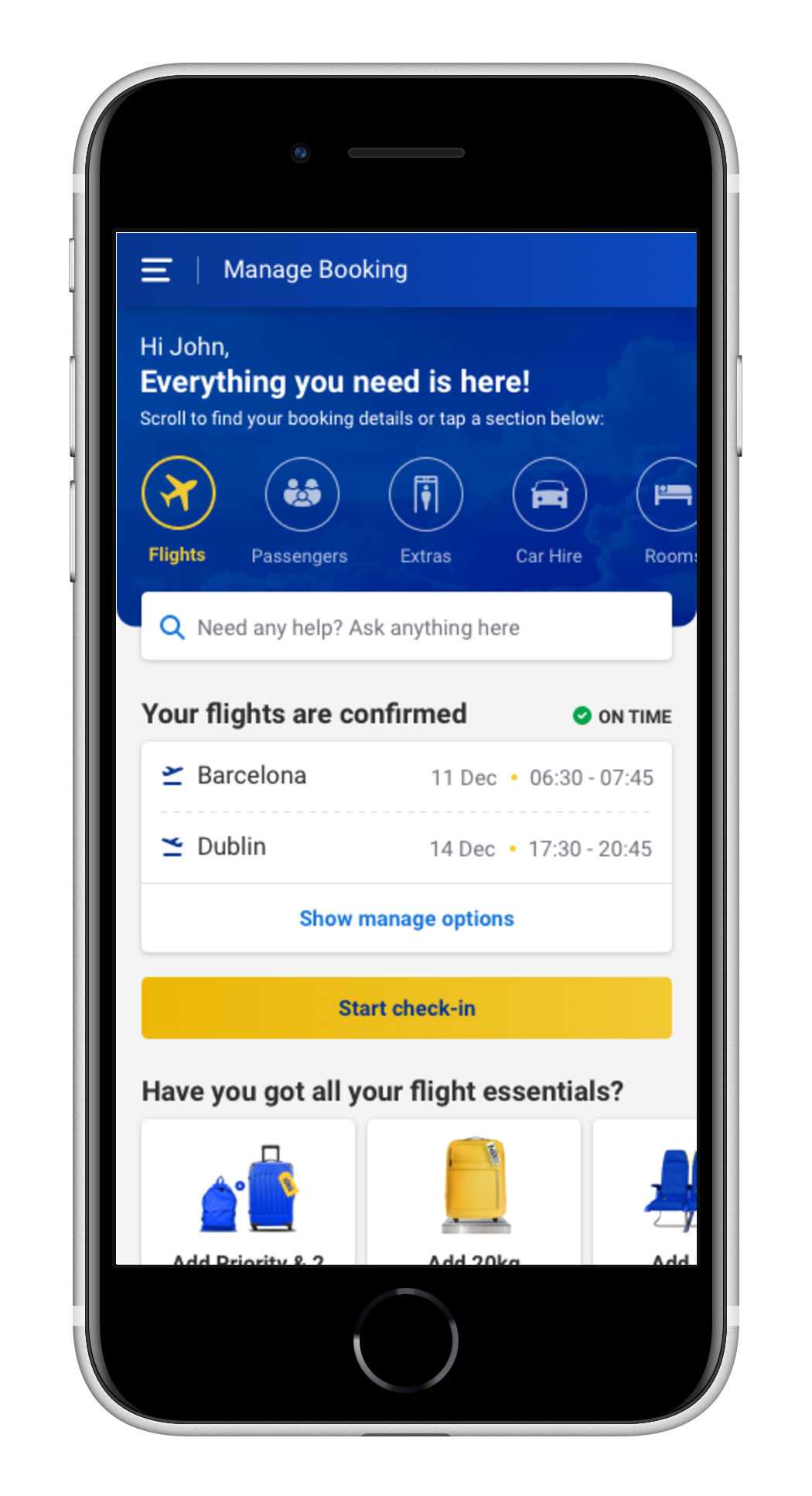
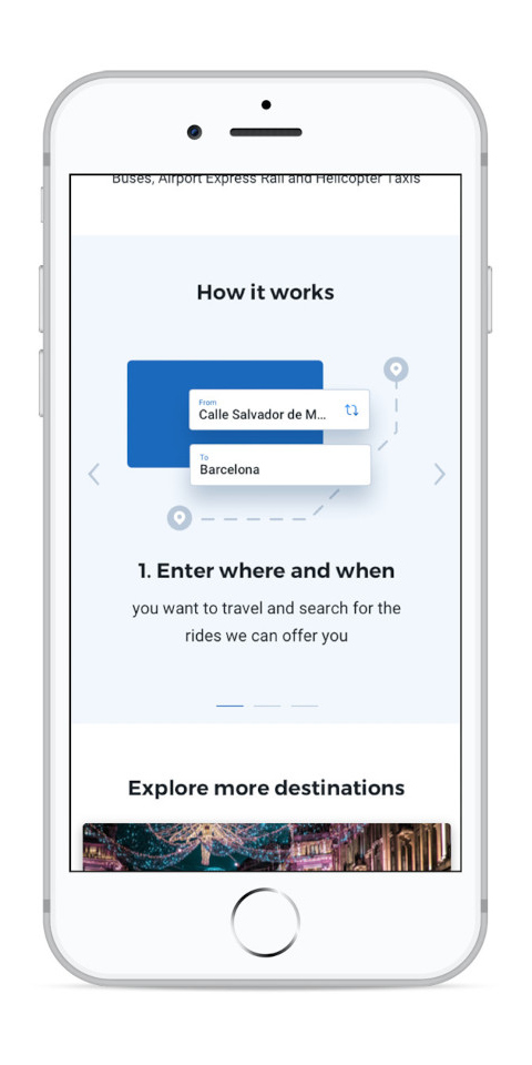
After COVID-19 and its impact on business operations there was growing consciousness within the business to invest in customer self-service, so we developed a new manage booking page.
Research
A survey with 2,441 Ryanair customers found:
- The main reason for contacting customer service (CS) was changing booking details, along with COVID-related issues
- 90% of customers reviewed the website/app before contacting CS
- 81% of customers declared that their query could not be solved on the website due to various issues
- From the 19% who could solve it using the website, 33% had additional questions and 20% needed reassurance
-> Customers want to self-serve online, but the current website does not allow them to do so successfully.
Data analysis done on contacts tagging by CS agents found:
- Managing a booking was the top reason for contacts (36% of all chats/calls in 52 weeks)
- 15% of the manage booking category related to confirming booking details
- Other functionalities included changing passenger type (8%), changing flight (6%), and changing name (3%)
-> Users seem unable to check basic booking information and complete certain functionalities, this suggests bad information architecture and complex design.
A UX heuristics and best practices analysis was conducted on the current website:
A brief interview with 12 customers found:
Design strategy
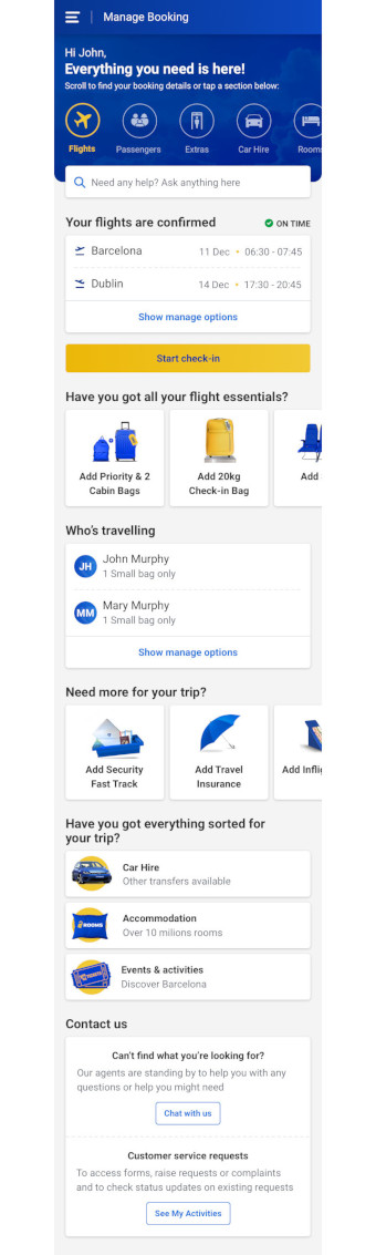
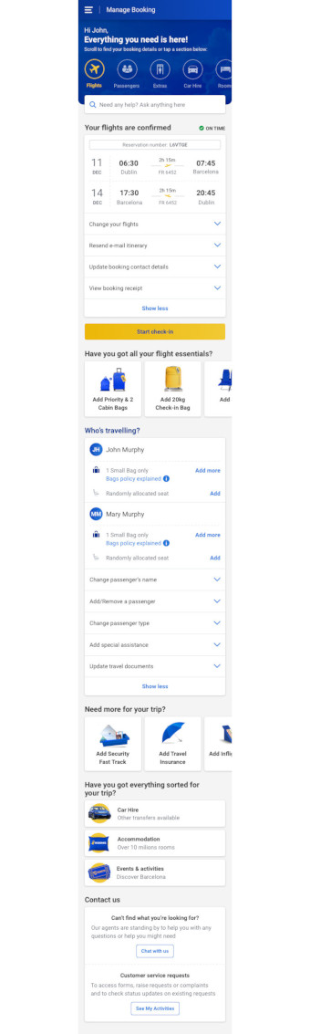
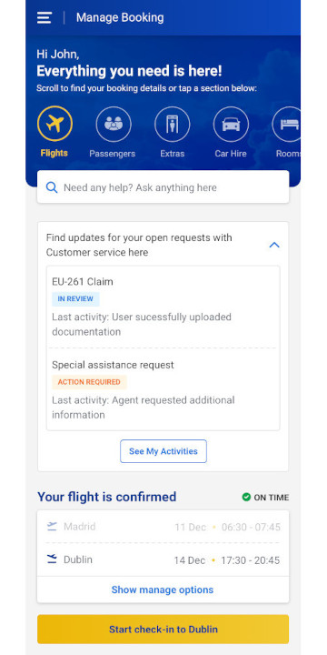
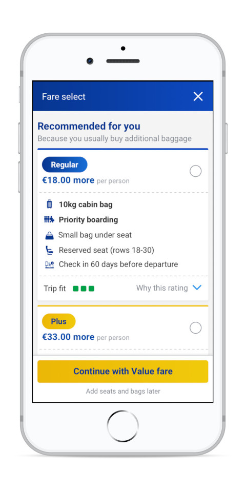
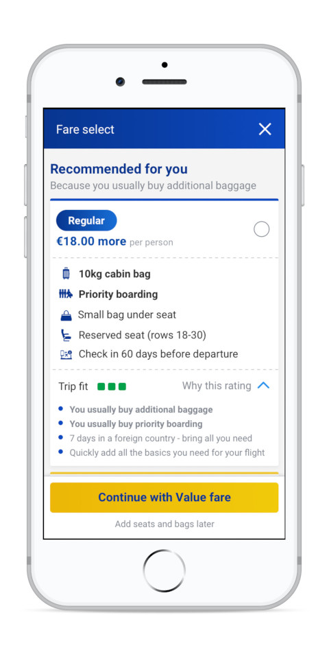
The redesign aims to provide users with all relevant information about their upcoming trip and quick access to modifying and adding new things to their trip.
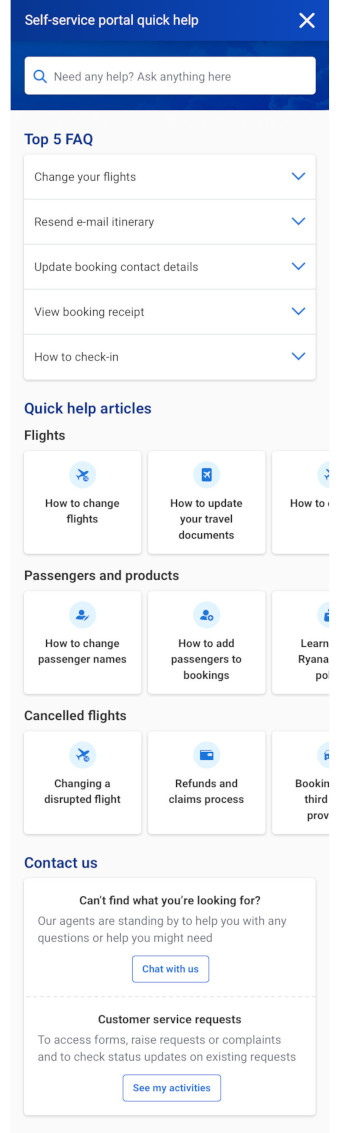
Quick help articles are added next to relevant functionality to proactively answer some of the questions customers are contacting CS about.
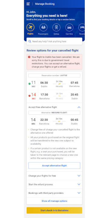
Flight cancellations are one of the highest contact drivers, so the redesign includes a clear and easy way to manage this situation
- The affected flight is presented along with possible solutions explained in a way to calm doubts users might have
- A new quick solution is introduced to switch to an alternative flight if there are available flights on the same route +/- 1 day of the original flight
-> The redesign encourages self-service and enables resolving their cancellation quickly and easily to reduce stress
Testing findings
Unmoderated user testing was performed on the main design and cancelled flight scenario.
- The testers were able to complete all tasks related to top contact drivers to CS such as checking basic booking data and making changes
- One improvement identified was making the search bar sticky so users always have a clear call to action even when they scroll down
Moderated user testing was performed on the redesign and the current website with 6 Ryanair customers who had been in contact with CS before.
Users completed the same set of tasks on both versions, and the order was randomized to avoid bias.
- The new design received very positive feedback and was considered "easier to use", "much less cluttered and better organized"
- Users especially liked the easy access to chat and open customer service requests
- Testers rated their global satisfaction with a 9.2/10, the ease-of-use 8.6/10 and the appeal 9.6/10 for the new design
- In comparison, the current website was considered cluttered, and users found the layout inconsistent
- Testers rated their global satisfaction with a 8/10, the ease-of-use 7.8/10 and the appeal 7/10 for the current website
- Two users couldn't find their baggage allowance on the current website, reflecting the contact drivers for CS data analysis